OverOps Product
The OverOps product allows developers to view log exceptions in their product’s code, even when the product is live. This app is very technical, with a target audience of developers. Over time, more and more features were added, resulting in a crowded and inconsistent interface. In this project, I focused on creating a long-term solution. I started with a style guide to prevent future inconsistencies and continued to re-design the interface. The result is a consistent, clear product that can grow over time.
The Side Bar
The sidebar received special attention. Through the sidebar users can:
Filter their views (view exceptions from the last day/week etc.)
See what they put under auto-hide (exceptions they wish to ignore)
view their Labels (which tags do they have)
While organizing the sidebar, a decision was made to add titles for each of the categories, enabling a collapse and expand option. This helped reduce crowdedness and created a more intuitive user experience. The “Views” category is the most important one in the sidebar. It is expanded by default when users arrive at the page, displaying the 8 most used views. The rest of the views are found under the ‘show more’ button.
The Style Guide
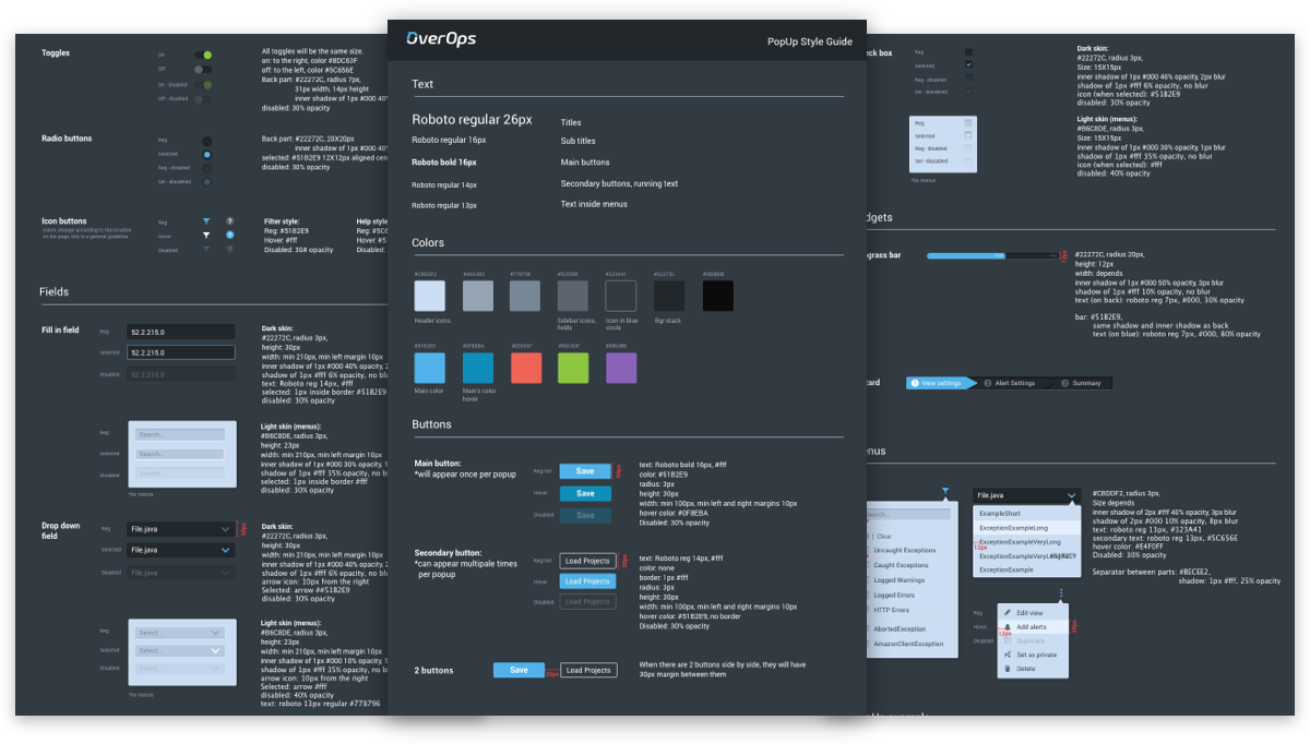
When I approached to create the style sheet, I started with remapping all the assets the app currently has. I found different kinds of toggles, buttons that behave differently between screens, and colors that don’t match. In the style sheet, I tried to unify everything and give as much information as I can to prevent this situation to repeat itself. In the process, I also decided to give the app’s assets more depth. In the old design everything was very flat, but looking at the more complex screens, you could see that the flat design didn’t work well enough. With the usage of depth, I was able to create different assets that signify to the users how to use them without causing confusion.
Implementing The New Style
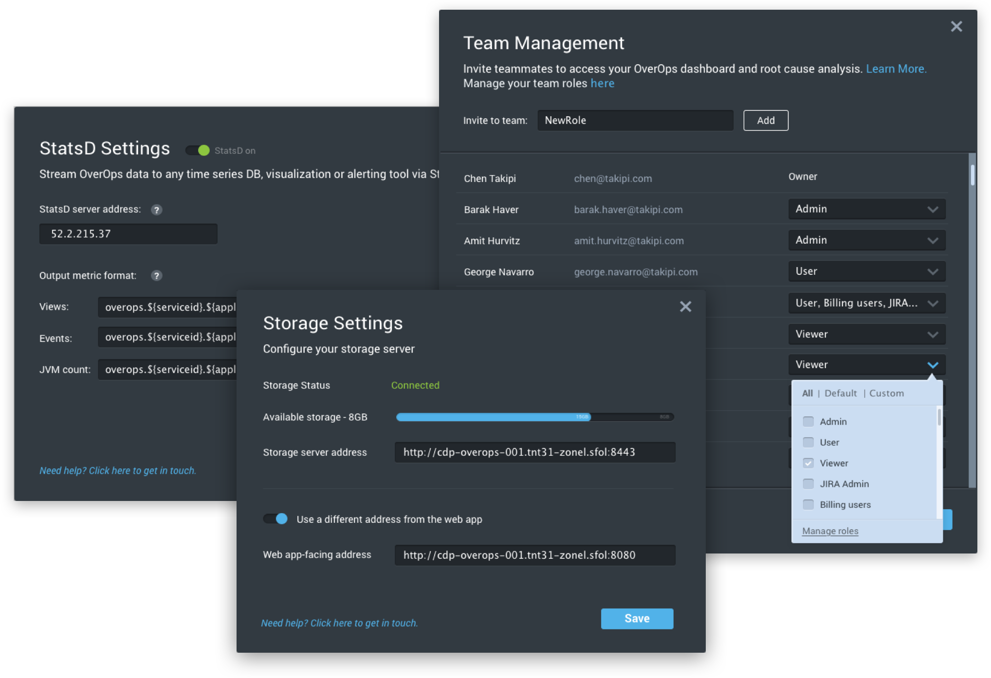
Once the new interface was approved, it was time to go step by step through our system and adapt each and every page to our new design. We aimed to do it pixel-perfect.


