OverOps Website
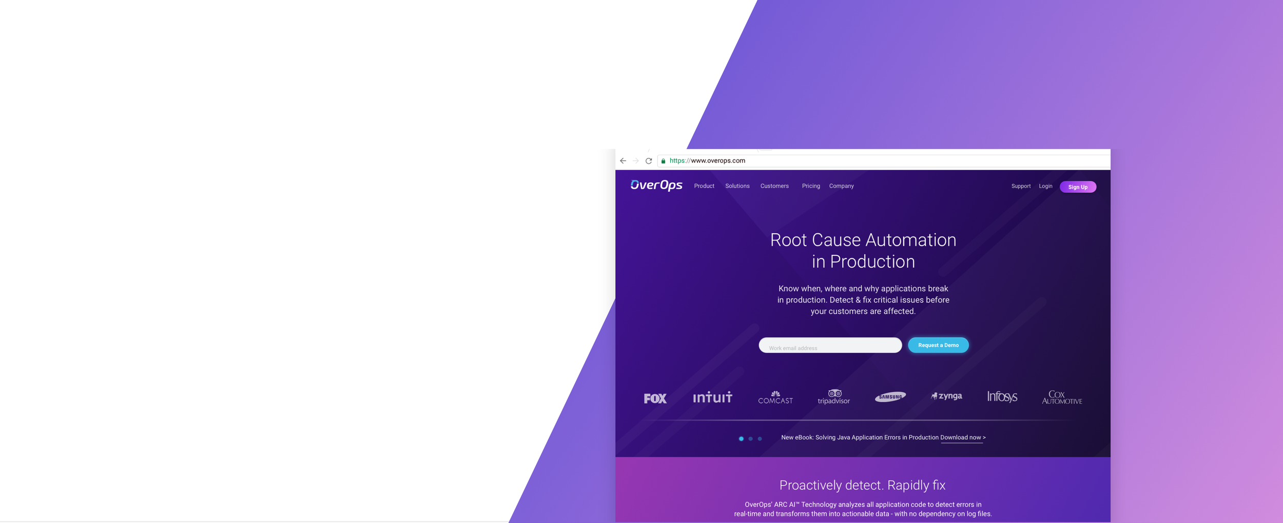
One of my favorite projects is the OverOps website. This website is ever-evolving and growing. In our most recent change, we went over the entire site with the purpose of making it more polished and enterprise-oriented. There are some of the new pages I designed. The purpose of making it more polished and enterprise-oriented. This is some of the new pages I designed.
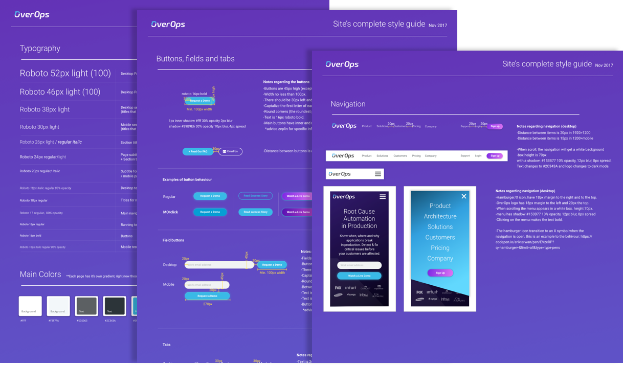
A New Style Guide
Our old site was very dark and included a small number of pages. During the last year, a large number of pages were created to answer more questions that occupied our users. The dark pages became white and more minimalistic. In the last iteration of the website went through, I wanted to create pages that are fun but still serious. In order to do so, I incorporated bright and bold gradients with white pages and a clean layout.
The Homepage
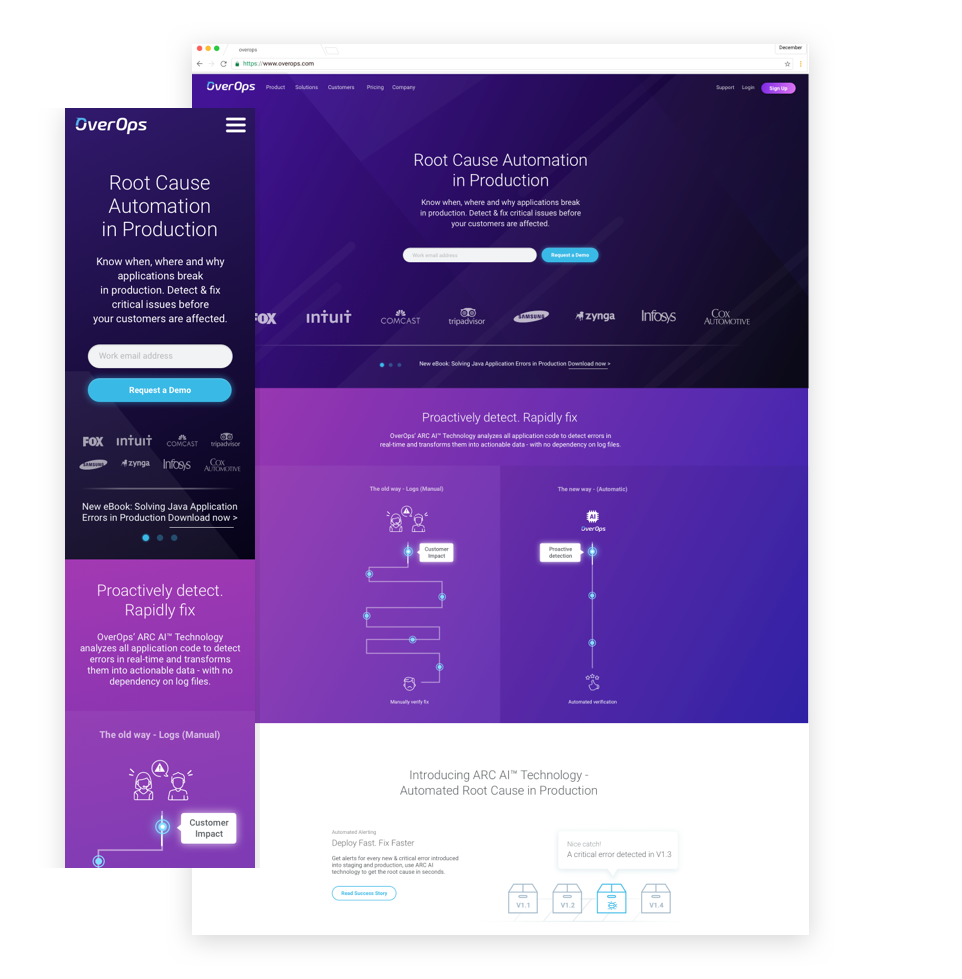
On the homepage, we wanted to create the best first impression possible. We have just a few microseconds to make our visitors believe we have something that is worth their time. Our challenge was to create assets that will showcase OverOps advantages in a quick and understandable way. While doing so, we also needed to incorporate all the information in a simple way that won’t make the page look overwhelming or terribly busy.
The Pricing Page
The pricing page is a very important page. This is the place where users should feel safe and reinsured. They should understand what they are looking at and have their questions answered here, so having a good and understandable UX was a must. We tried to make our pricing plans as readable as possible and also attached a table of features and a FAQ part.

Testimonials
Our testimonials gallery was a small project I was particularly fond of. We wanted to create a gallery that will showcase selected quotes from our users, and we wanted a gallery that we will be able to use on different pages. The gallery was supposed to show a large number of quotes (at least three), the company’s name, the user’s name and the quote itself.
The Product Page
The product page is our most technical page. On this page we want the site visitors to understand what this product has to offer. Why is it advanced technologically and how can they gain from using this product. We don’t have a lot of time to make them understand a very complex product, so this page was designed in order to show the information as clearly as possible. We wanted visitors to feel comfortable on this page so we used bright blue colors and lots of white space.
Customer Stories
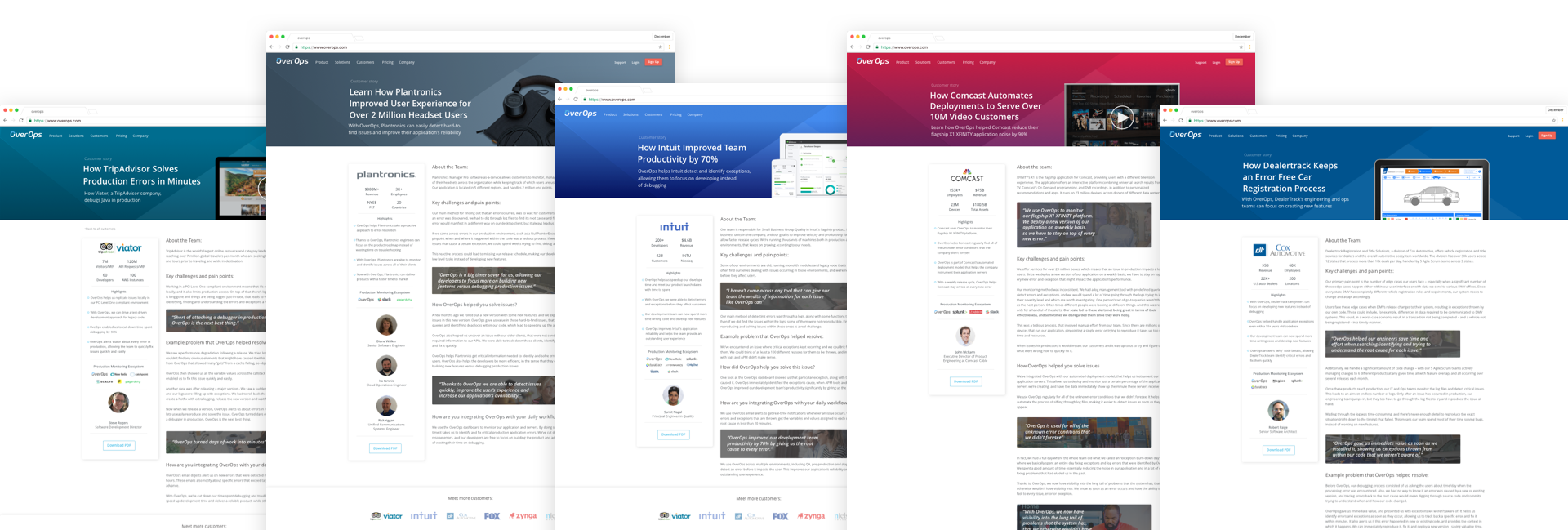
In the customer stories pages, we wanted to represent well those companies and their stories. Those pages are all about them and how they use the OverOps product, so in order to give it a more personal touch, the page is designed as if it was on the company’s website. The colors are colors that identify with the company and the images are images of that company. We summarized important information to the left to make the page easy to understand even if the user doesn’t have the time to read the entire story.


